
Googlebook: Adaptive Android Reaches the Laptop
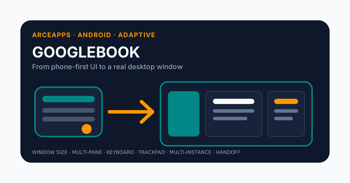
Table of Contents
For years, “supporting large screens on Android” usually meant one of two things: making sure the UI did not break on a tablet, or adding an alternative layout that used some of the extra space.
Googlebook forces a different question.
Google introduced Googlebook on September 22, 2026 as a new laptop category built on a shared Android foundation and ChromeOS desktop fundamentals. The official developer material describes devices from partners including HP, Dell, Lenovo, Acer, and Asus, with physical keyboards, precision trackpads, touch displays, and a freeform desktop windowing environment.
That means an Android app can no longer ask only whether it fits on a larger display.
It has to ask whether it behaves like a desktop application.
Those are not the same thing.
A 6.7-inch phone and a laptop may share the Android application stack, but users do not expect the same information density, navigation, input model, or window behavior from both.
Googlebook makes adaptive development much more concrete.
I have already written about Android Skills and the way Google is building tooling that helps both developers and coding agents stay aligned with current Android APIs. The Googlebook documentation even points developers toward the official adaptive skill for refactoring phone-oriented Compose layouts. This article focuses on the result rather than the agent: what actually has to change when a phone-first Android app is expected to feel natural on a laptop.
The short answer is: much more than increasing a max width.
Googlebook is not “Android on a bigger screen”
The easiest mental picture is a mobile app floating inside a large desktop window.
It will probably launch.
That does not mean it belongs there.
Google’s guidance is explicit: desktop experiences should not stretch phone interfaces across a wide surface. They should reorganize information into functional groups, take advantage of higher information density, support precise input, and coexist with active multitasking.
The difference becomes obvious with a simple phone UI:
top bar
list
floating action button
bottom navigation
If I simply let that UI grow to 1400 pixels wide, I get something like:
┌─────────────────────────────────────────────────────────────┐
│                         top bar                             │
├─────────────────────────────────────────────────────────────┤
│                                                             │
│                    extremely wide list                      │
│                                                             │
│                                                             │
│                                                   (+)       │
├─────────────────────────────────────────────────────────────┤
│                     bottom navigation                       │
└─────────────────────────────────────────────────────────────┘
It technically scales. It also wastes the workspace and keeps patterns designed for a thumb.
A genuinely adaptive version might become:
┌──────────────┬──────────────────────────────┬───────────────┐
│ persistent   │ list                         │ detail        │
│ navigation   │                              │               │
│              │ item 1                       │ selected      │
│              │ item 2                       │ content       │
│              │ item 3                       │               │
└──────────────┴──────────────────────────────┴───────────────┘
The app is still the same product.
The structure changes because available space changes what the user can reasonably do at once.
That is the heart of adaptive design.
Design for windows, not device labels
One of the most useful ideas in modern Android guidance is that layout decisions should respond to the available window, not the marketing name of the hardware.
I do not want this:
if (isGooglebook) {
    DesktopScreen()
} else {
    MobileScreen()
}
That would recreate the fragmentation adaptive development is supposed to prevent.
The same Googlebook can run my app:
- maximized;
- snapped beside another app;
- in a narrow floating window;
- on a connected display;
- while the user continuously resizes it.
The meaningful question is therefore not:
Am I on a laptop?
It is:
How much usable window space do I have right now?
Window size classes remain one of the core tools for making those decisions.
A layout can shift roughly along this spectrum:
compact  -> one primary surface
medium   -> richer navigation or partial split
expanded -> multiple simultaneous panes
The important part is that the same logic improves tablets, foldables, and resizable Android windows elsewhere.
Googlebook does not require a second app.
It makes weaknesses in the first app more visible.
Navigation 3 turns navigation into layout
A particularly interesting change happens when a phone navigation sequence can become a multi-pane scene.
On a phone, a list-detail relationship often looks like:
List -> tap -> DetailTwo destinations, displayed one at a time.
On a wide window, keeping only one visible throws away useful context.
Navigation 3 and Material 3 Adaptive let those same semantic entries be presented together through scene strategies such as:
ListDetailSceneStrategy;SupportingPaneSceneStrategy.
Conceptually:
compact window
┌─────────────┐
│    LIST     │
└─────────────┘
      ↓ tap
┌─────────────┐
│   DETAIL    │
└─────────────┘

expanded window
┌──────────────────┬──────────────────────────┐
│       LIST       │          DETAIL          │
└──────────────────┴──────────────────────────┘
I like this model because it avoids maintaining two unrelated navigation systems.
There is no separate “tablet app.”
The relationship between destinations stays the same while the representation changes with the space available.
That is architectural adaptation rather than pixel scaling.
Three panes can change the task itself
List-detail is only the beginning.
A desktop-oriented app may naturally use:
navigation/list | main content | supporting contextExamples are easy to find:
- mail: folders | messages | selected message;
- editor: files | document | properties;
- media app: library | content | queue;
- notes: notebooks | note | references.
SupportingPaneSceneStrategy can model main, supporting, and extra panes that appear or adapt based on available space.
This matters because desktop users are often trying to compare or coordinate information, not merely move between screens.
On a phone, replacing one surface with another is normal.
On a laptop, repeatedly hiding context can feel unnecessarily restrictive.
Googlebook pushes Android toward a model where “more room” should often mean more useful context at once, not larger cards and longer line lengths.
The window can change while the user is working
Desktop-style freeform windowing introduces another requirement: the available size is not stable.
That breaks a lot of comfortable assumptions:
- width can change at any moment;
- orientation does not summarize the layout;
- “tablet” does not guarantee an expanded window;
- a maximized app can become compact without a new session;
- the window may move between displays.
The UI needs to reflow continuously.
A strong adaptive layout should not behave as if phone and desktop are two disconnected applications. It should preserve selection and task continuity while reorganizing the interface.
If a selected message is visible in a two-pane layout, narrowing the window should not erase the selection simply because the detail pane is temporarily not shown beside the list.
The state needs to exist independently from the current presentation:
application state
      ↓
adaptive decision
      ↓
current representation
This aligns well with good Compose architecture in general.
I do not want state hidden inside a “desktop composable.”
I want the same state to be renderable as one, two, or three panes.
Mouse and trackpad expose touch-only assumptions
A UI built entirely around touch may technically respond to a mouse.
That is not the same thing as feeling right.
Googlebook brings desktop input expectations:
- pointer feedback;
- hover;
- right click;
- precise selection;
- trackpad scrolling;
- physical keyboard;
- shortcuts.
Jetpack Compose already covers a useful amount of the foundation. Android’s adaptive documentation notes that Compose 1.7 and newer support keyboard Tab navigation plus common mouse and trackpad click, selection, and scroll behavior.
But basic compatibility is only step one.
A desktop interaction might want:
hover -> visible feedback
right click -> context menu
Ctrl/Cmd + K -> command
Delete -> remove selection
Shift -> range selection
cursor -> text / resize / drag affordance
On a phone, hiding an action behind long press may be fine.
With a mouse, a context menu can be the obvious interaction.
On mobile, a floating action button can dominate the screen.
On desktop, a persistent toolbar or command surface may be more appropriate.
The form factor changes ergonomics, not only dimensions.
Keyboard shortcuts should be discoverable
A competent desktop application should do more than accept key events.
Users need a way to discover shortcuts.
Android provides Keyboard Shortcuts Helper, and the Googlebook guidance explicitly points developers toward exposing app shortcuts through the system.
That is useful for two reasons.
First, it avoids building a custom shortcut-discovery system for something the platform already understands.
Second, it forces keyboard support to become a first-class interaction model instead of a last-minute accessibility checkbox.
For an app used for long sessions, shortcuts such as:
Ctrl/Cmd + N -> new
Ctrl/Cmd + F -> search
Ctrl/Cmd + S -> save
Ctrl/Cmd + W -> close context
can make a major difference.
The exact commands depend on the product, but the principle is the same: desktop input should save repeated physical effort.
Multi-instance means one app no longer equals one window
This is where Googlebook starts to feel fundamentally different from “a big Android tablet.”
Android desktop windowing supports multiple instances of an application.
Starting with Android 15, an app can tell the system that it supports this through:
<application>
    <property
        android:name="android.window.PROPERTY_SUPPORTS_MULTI_INSTANCE_SYSTEM_UI"
        android:value="true" />
</application>
That allows system UI to offer actions such as “New window.”
The manifest line is small. The architecture behind it is not.
What happens when the user opens:
Window A -> document/project 1
Window B -> document/project 2
Is selection stored globally?
Does a deep link reuse an existing task or open a separate one?
Is a process singleton holding state that should belong to a window?
Does the navigation architecture assume there is only one visible back stack?
Multi-instance support cannot be completed by setting a property.
The property exposes a capability the app must actually be designed to survive.
Drag and drop stops being a decorative extra
Once multiple windows exist, moving data directly between them becomes natural.
Googlebook’s desktop guidance emphasizes cross-window drag and drop for things such as:
- text;
- images;
- files;
- app-specific objects.
Android’s desktop windowing guidance even describes flows where dragging an item out can create or feed another app instance.
Compose provides APIs such as dragAndDropSource, while Android 15 includes flags designed for multi-instance drag operations within the same application.
The exact API names matter less than the shift in mental model:
mobile:
select item -> choose action -> choose destination

desktop:
drag the item directly to the visible destination
With a pointer and multiple windows on screen, direct manipulation often communicates intent more efficiently.
The window frame becomes part of the product
Desktop windowing gives applications a caption area around the window.
Google’s guidance allows apps to customize parts of this region with things such as:
- backgrounds;
- search fields;
- tabs.
System window controls still have to remain respected.
This creates a design boundary that phone apps rarely need to consider.
On mobile, the top app bar is usually entirely inside the application’s canvas.
On desktop, the application shares its top edge with window management.
A careless port can end up with duplicated bars, wasted vertical space, or controls that visually fight the system’s own minimize/maximize/close affordances.
The UI begins to feel less like “one giant Android screen” and more like an application occupying a window inside a workspace.
Continue On turns phone and laptop into one task
One of the most interesting Googlebook features is Continue On.
Starting with Android 17, API level 37, an activity on the phone can enable cross-device handoff to Googlebook. The system can surface a suggestion in the laptop taskbar for the activity the user was running on the nearby phone.
This is more than launching the same package.
Apps can transfer contextual information through HandoffActivityData.
A conceptual flow might be:
phone:
document 42
position 78%
tab "comments"

        ↓ Continue On

Googlebook:
open document 42
restore position
restore task context
render as desktop multi-pane UI
The official documentation describes multiple handoff patterns:
- app-to-app;
- app-to-app with a web fallback;
- direct-to-web.
That flexibility matters.
An Android app optimized for Googlebook can continue natively.
A service whose primary desktop experience is web can hand off to a URL instead.
Cross-device continuity does not require pretending that every destination must use the same rendering technology.
Handoff state also needs to adapt
There is a subtle problem here.
Suppose the phone is showing a full-screen detail page.
On Googlebook, restoring that state as “detail only” may waste the desktop layout.
The better representation may be:
list with selected item | restored detailThe official handoff guidance explicitly recommends adapting incoming state to the receiving multi-pane layout.
That reveals an important principle:
handoff transfers intent and context, not pixels.
Useful state might be:
- document ID;
- selected item;
- scroll or reading position;
- filters;
- active tab;
- logical cursor position.
The destination decides how to render it.
This is good architecture even before Googlebook because it forces the app to distinguish semantic state from accidental UI state.
Resize-safe state is no longer a rare edge case
A desktop window gets resized constantly.
If selection, scroll, or work-in-progress is lost each time, the app feels broken immediately.
Android has long recommended preserving important state across configuration changes using ViewModel, SavedStateHandle, rememberSaveable, or another mechanism appropriate to the lifetime of the data.
On Googlebook, that guidance becomes everyday UX rather than occasional defensive coding.
I am no longer designing for:
The user rotated the phone once.
I am designing for:
drag edge
drag again
maximize
restore
snap beside another app
change width again
Frequency changes severity.
A state-loss bug that is merely annoying on a phone can become constant on desktop.
A real migration from phone-first to adaptive-first
If I took an existing Android app designed almost entirely for phones, I would not create a “Googlebook branch” and rebuild the interface.
I would migrate in layers.
Step 1: remove fixed-size assumptions
Search for:
- hardcoded widths;
- orientation-only layout decisions;
- screens that assume full display ownership;
- dialogs that could become supporting panes;
- grids with fixed column counts;
- components that grow indefinitely.
Step 2: separate state from layout
Make sure the app knows independently:
what is selected
what data is loaded
what operation is active
versus:
how many panes are currently visibleStep 3: introduce window-aware layout decisions
Move from a single layout toward compact, medium, and expanded representations where the task benefits.
Step 4: convert related navigation into multi-pane scenes
List-detail and supporting-pane relationships are the obvious candidates.
Step 5: audit input
Explicitly test:
- Tab;
- keyboard actions;
- mouse;
- trackpad;
- hover;
- context menus;
- shortcuts.
Step 6: abuse freeform resize
Do not validate only three static previews. Drag the window aggressively through awkward sizes.
Step 7: decide whether multi-instance has real value
Not every app needs several windows.
If it does, test state isolation rather than merely enabling the system UI flag.
Step 8: add drag and drop where it expresses the action better
Not because it looks desktop-like.
Because it simplifies a real workflow.
Step 9: identify continuity opportunities
Ask which tasks genuinely make sense to start on the phone and continue on the laptop.
Step 10: evaluate against desktop quality guidance
Use Android’s adaptive and desktop quality guidelines rather than relying only on personal intuition.
This migration improves tablets and foldables at the same time.
That is why Googlebook can be a catalyst without becoming a separate product fork.
Not every app needs to become Photoshop
“Desktop-class” does not mean filling every app with panes, shortcuts, toolbars, and extra windows.
A simple app can remain simple.
A calculator does not need three panes.
A timer may not need multi-instance.
A puzzle game may benefit from keyboard support and reliable resizing without becoming a productivity suite.
Adaptation should follow the task.
The right question is:
What new expectations appear because the user has more space, precise input, and active multitasking?
If the answer is “almost none,” do not invent complexity.
If the answer is “compare two documents side by side,” then the architecture should support that workflow.
The goal is to feel natural, not to demonstrate how many desktop APIs I have learned.
Testing discipline changes with the desktop emulator
Google provides a desktop emulator through Android Studio Preview for testing this environment.
That gives developers a place to exercise:
- freeform resizing;
- multiple windows;
- multi-instance;
- mouse;
- trackpad;
- keyboard.
This is essential.
If an adaptive feature is tested only on a portrait phone, the architecture may exist in code without existing in the product.
My minimum manual matrix would include:
compact narrow window
medium window
expanded maximized window
continuous resize
keyboard-only navigation
mouse / trackpad
two app instances
drag and drop, where supported
handoff, where supported
Then automate the stable pieces:
- state unit tests;
- Compose screenshot tests;
- navigation logic;
- selection behavior;
- persistence.
Ergonomic and visual quality still need human inspection.
Google Play turns adaptive quality into distribution
There is also a product incentive beyond engineering quality.
Google says apps optimized for Googlebook can gain:
- desktop optimization badging;
- improved visibility;
- dedicated collections;
- prominence when a user configures a Googlebook from an Android phone.
That turns desktop quality into a distribution signal.
I would not redesign an app only for a badge.
But if adaptive work already improves tablets, foldables, and desktop windows, extra discoverability increases the payoff.
Google appears to be trying to avoid the old platform problem where “the app is technically available” but obviously feels like an awkward port.
One codebase does not mean one rigid UI
The official promise is that developers do not need to build a completely separate application for Googlebook.
I agree, with one important clarification.
One codebase does not mean rendering exactly the same layout everywhere.
It means sharing:
- domain logic;
- data;
- state;
- semantic navigation;
- components;
- application behavior.
The presentation can still change significantly.
A healthy adaptive architecture can look like:
             domain / state
                   │
                   ▼
          semantic navigation
                   │
      ┌────────────┼────────────┐
      ▼            ▼            ▼
   compact       medium      expanded
      │            │            │
   1 pane       1-2 panes     2-3 panes
These are not three applications.
They are three projections of the same task model.
Googlebook also reinforces agentic Android development
There is an interesting developer-tooling detail in the official material.
Googlebook documentation points toward an adaptive skill for AI coding agents, installable through the Android CLI, that provides guidance for refactoring phone layouts into responsive Compose structures.
That connects directly with the Android Skills ecosystem.
Adaptive migration contains patterns that are structured enough to be partially automated:
- identify list-detail relationships;
- migrate navigation toward Navigation 3 scenes;
- find fixed-size assumptions;
- introduce window-aware containers;
- review input support.
But I apply the same rule here as with every coding agent: automating the transformation does not verify the result.
A migration can compile and still feel terrible with a mouse.
The agent can change structure.
The experience still requires judgment.
What this changes for my own Android apps
Googlebook makes me reconsider an old indie-development strategy that was once fairly rational:
Build for phone first. Deal with tablets later.
That “later” now includes too many environments:
- foldables;
- tablets;
- desktop windowing;
- Googlebook;
- connected displays.
The answer is not five separate implementations.
The answer is designing around adaptive windows earlier.
Even if a product remains mostly phone-centric, architecture that does not mix state with screen size is cleaner.
A list that can naturally become list-detail is usually better structured.
Navigation that works with a keyboard often has better focus semantics.
State that can survive two windows tends to be less tightly coupled to a single Activity.
Googlebook makes old architectural assumptions visible.
What I would avoid
I also have a clear list of traps.
Do not branch on device model
No isGooglebook UI architecture.
Do not create a separate desktop module by default
Divergence should be justified by a genuinely platform-specific capability.
Do not assume expanded because the hardware is a laptop
The window can be narrow.
Do not fill the screen simply because space exists
Higher density is not the same as clutter.
Do not enable multi-instance without validating state
Two broken windows are worse than one reliable window.
Do not treat mouse as touch with a cursor attached
Hover, context menus, pointer affordances, and shortcuts matter.
Do not hand off visual UI state
Transfer semantic context.
Do not trust previews alone
Real resize, focus, pointer behavior, and drag and drop need runtime testing.
Those constraints are as important as the new APIs.
My mental model for Googlebook
After going through the official guidance, the most useful summary for me is:
NOT:
Android app + large display

YES:
Android app + changing window
            + precision input
            + keyboard
            + multitasking
            + continuity
That shift explains almost everything else.
If I design for a large display, I make components wider.
If I design for a changing window, I think about reflow.
If I design for precision, I think about hover, targets, and cursor feedback.
If I design for keyboard, I think about focus and shortcuts.
If I design for multitasking, I think about per-window state, drag and drop, and multi-instance.
If I design for continuity, I separate task context from presentation.
Googlebook does not add one isolated requirement.
It adds a coherent set of desktop expectations to Android applications.
Conclusion
Googlebook matters to Android developers less because of any single piece of laptop hardware and more because of what it forces applications to become better at.
For a long time, tablet optimization could be postponed as a secondary enhancement.
Desktop usage makes the difference between “the app does not crash” and “the app belongs on this device” impossible to ignore.
The good news is that Google is not asking developers to target a completely separate platform.
The building blocks continue Android’s existing direction:
- window size classes;
- Jetpack Compose;
- Material 3 Adaptive;
- Navigation 3 scenes;
- desktop windowing;
- multi-window;
- keyboard and pointer input;
- Android 17 cross-device continuity.
Improving an app for Googlebook can therefore improve it for tablets, foldables, and every environment where the Android window stops looking like a portrait phone.
My practical conclusion is simple:
I would not begin by building a Googlebook version. I would begin by removing the assumption that an Android app owns one phone-shaped window.
Once that assumption disappears, the laptop stops feeling like an awkward port target.
It becomes another, more demanding, way of running the same application.
References
- Android Developers Blog — Land your apps on Googlebook with adaptive development
- Android Developers — Build adaptive apps for Googlebook
- Android Developers — Get started with adaptive apps
- Android Developers — Support desktop windowing
- Android Developers — Support cross-device continuity on Googlebook
- Android Developers — Navigation 3 Scenes
- Android Developers — Adaptive skill for AI agents
- Android Skills: AI-guided Android development
You might also be interested in

design.md: The New Standard for AI-Assisted UI/UX Design
Discover how design.md complements agents.md, focusing on design decisions, UI/UX, accessibility, and Jetpack Compose for Android development in the era of AI agents.
Google Stitch
Discover how Google Stitch, powered by Gemini, is transforming UI design in Android. Examples, guides, tricks, and its integration with Jetpack Compose and Kotlin.

MVVM: The View Layer Guide
How to implement the View layer in MVVM with Jetpack Compose. State collection, error handling, and separation of concerns.